Page 69 - FoodFocusThailand No.211 OCTOBER 2023
P. 69
STRENGTHEN THE PACKAGINGGTHEN THE PACKAGING
                                                                                        STREN
                     It is undeniable that being “different” is a fundamental feature for
                     packaging to be unique and stand out from its competitors. But do you
                     know that among those differences, it also often involves details and
                     approaches that bring about these differences? So, I asked myself:
                     “Ah....would it be feasibly possible if we were to produce a set
                     of tools to create unique packaging?”

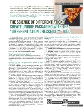
                     The Science of Differentiation:


                     Create Unique Packaging with the


                     “Differentiation Checklist™” Tool


                      To answer this question, I spent nearly eight years conducting  Let’s conduct a deep dive into the details of the 8
                    trials and experiencing errors on the global packaging  keywords.
                    competition stage (being different in the competition can be   1. Color refers to the logo’s color and the observation of the
                    considered an incredible feat). It wasn’t until my company,  overall packaging color theme used by the competitors in the
                    Prompt Design, became the 15 -ranked packaging design  market. What are the prevailing colors that each brand is using?
                                               th
                    company in the world that I consolidated and filtered through  For example, if a competitor uses blue and the product is a well-
                    all of my extensive experience and expertise until a design tool  known brand in the market, then we should avoid colors that are
                    was born. I am now ready to share this “Differentiation  similar to that famous brand.
                    Checklist™”  tool  with  my  readers  who  want  to  make  a   2. Graphic refers to the elements that appear on the packaging,
                    difference in their products. This design tool can also simply be  such as graphics, images, and the printing techniques used.
                    known as “The Ultimate Differentiation Tool.”          3. Message refers to the key text on the packaging, such as
                                                                        the product name, claims, and the various icons that identify the
                    What’s good about it, and why?                      product or its benefits.
                    In a nutshell, this tool serves as a framework for keywords, i.e.,   4. Functional refers to what other functions this packaging can
                    to remind designers to think or consider these matters before  use. For example, can it be easily opened, easy to carry around,
                    embarking on a design or making final decisions on a packaging  or used to carry things in, etc.
                    design.                                                5. Shape refers to the shape of the packaging. This is as
                                                                        important as any other keyword because the shape of the
                    How  to  use  the  straightforward  Differentiation  packaging can make a significant difference to our products and
                    Checklist™ tool                                     become an iconic image in the future. For example, the Toblerone
                    Considering Figure 1, you will see 8 colors indicated with a  chocolate box has a unique triangular-shaped box or even the
                    specific keyword that will help designers plan their ideas. These  shape of the Yakult drinking yogurt bottle or various well-known
                    keywords are to be inserted into a table with different fields  liquor bottles full of unfamiliar shapes. Therefore, it can be
                    (Figure 2), with the first row arranged from top to bottom  concluded that the shape of the packaging can be one of the key
                    indicating the brand of Competitor A. The next column belongs  factors in making a difference.
                    to Competitor B and others, respectively, and your brand will   6. Material refers to the various materials used for packaging,
                    be indicated in the last column.                    whether wood, aluminum, plastic, paper, or even different
                      Thereafter, analyze your competitors by stating or inserting  environmental-friendly materials. However, always keep in mind
                    photos to make it easier to understand them (Figure 3). For  that the material used must be able to protect the products as well.
                    example, in the Color field, you can enter what colors other   7. Interactive refers to the interaction, the true meaning of
                    brands are using; in the Graphic field, you can enter graphics  which refers to how our packaging interacts with the consumers.
                    or photos of that particular brand, etc.            For example, the packaging of a Coke bottle whereby the label
                      Subsequently, when all fields have been filled, we should  can be removed and tied as a bow, or even the use of AR scanning
                    be able to see and understand the overall picture of that  technology on McDonald’s french fries boxes that can be scanned
                    particular market and the packaged products used to  to allow the consumer to play football games, etc.
                    communicate their brands. In this regard, we should also be   8. Production refers to the possibility of changes that can be
                    able to clearly perceive the issues that should be addressed for  made to our production process, which includes the product
                    our brand and provide feedback or criticism on the styles  production line, the packaging lines, the packing lines, and the
                    proposed by our packaging designers. Additionally, we should  sealing lines, all the way until the product is fully completed.
                    be able to immediately recognize if our design is really different   Considering all of these factors should motivate us to question
                    or if such a difference will really be able to compete in the market.  our own brand or a brand that is about to be developed: “Have
                      The more our packaging is perceived to be unique and  we thought through about this... (8 keywords) ...yet?”. I hope
                    different from other brands in each keyword field, the more  you will find all these unexpected differences just like me.
                    differences appear. This Differentiation Checklist™ tool has
                    been published in many countries, including Japan, China, and
                    Taiwan, and  has also  been published  in the book of  the
                    Packaging  Design Association  in  Japan. Therefore,  I  am    More Information        Service Info C012
                    confident that it can be sufficiently compelling if the above-
                    mentioned process is applied.                                                 OCT  2023 FOOD FOCUS THAILAND  69


                                                                                                                     21/9/2566 BE   14:25
         66-69_Strength the Pack_�����.indd   69                                                                     21/9/2566 BE   14:25
         66-69_Strength the Pack_�����.indd   69

